Logo designs are quite important for businesses, particularly when the firm is specialized. The logo designs vary based on the requirements of the specialty. Different niches elicit diverse expectations from individuals.
Your logo design must meet these standards. For instance, you cannot include a computer icon in your logo if your specialization is unrelated to information technology. The luxury brand requires a logo that conveys to its audience that the company offers luxury.
If you have a jewelry brand, you must have a logo for a premium jewelry brand. The logo might be a Jewelry logo with rings, pendants, crowns, and diamonds, or it can be a Wordmark logo.
Your logo for your jewelry company is essential for the following reasons:
- It embodies your brand.
- It helps people recall your brand.
- It conveys the brand’s ideals.
- It helps you distinguish yourself from the competition.
- It assists your audience in understanding your company.
- It makes people want to see what’s in the jewelry box.
A seamless and beautiful design consists of three elements. The first is your company’s logo. There are many logotypes. Wordmark logos, monogram logos, and icon logos are the kinds you may utilize for your Jewelry logo design. Most Jewelry logos are made in one of these styles. Wordmark and monogram logos are often used by luxury brands. Both are affected by the font you use. Different fonts are used for different things by professional designers. Icons can send a subtle message about your brand. You can use icons to help the type or the other way around. Depending on what you do, you can use icons.
Here are the Top 10 Jewelry Logo Designs for Your Inspiration:
Logos that maintained clarity:
The logo must adhere to Clarity and elegance. Use the designs and typefaces that represent your brand’s concept. Any ambiguity in your logo might harm your brand.
Serif typefaces are already legible. However, while utilizing custom fonts, you should ensure that the text is legible. The same holds for your symbols. In situations when you are uncertain about clarity, seek input. If feasible, get comments from your target audience after the logo has been designed. Here are some inspirations:
- Reliable Jewelry
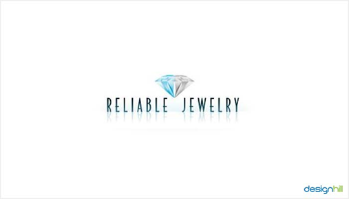
The logo for Reliable Jewelry is a one-of-a-kind design that exemplifies the importance of elegance in terms of a design. The overall attractiveness of this logo is amplified by the glittering effect of varying colours of blue and a touch of white.
- Jewelry Watch Works
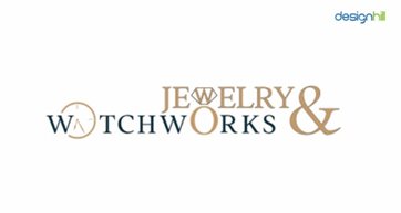
The logo for Jewelry Watch Works is built on typography and relies on the smart use of typefaces to communicate with visitors. Therefore, the designer used large serif fonts to represent the brand’s dominance in its jewellery specialty. In addition, the diamond and circles, as well as the stylised & signs, distinguish the design from other logos in the business.
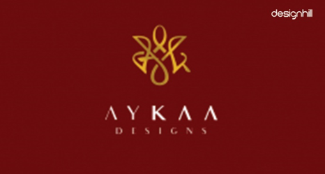
- AYKAA Designs

This logo for high-end jewellery employs classical designs to represent the refinement and sophistication of the brand’s products. Additionally, the typefaces utilised to create the brand name are bold.
- Maxzariel
The Maxzariel logo consists of a large letter “M” as an easily recognisable symbol that emphasises luxury, superior quality, elegance, and refinement.
Logos that followed Simplicity and Minimalism
Simple logos effectively communicate the message. You are not required to implement every piece described in this article. Simply use those that best represent your jewellery business. When designing a professional and standardised logo, you should use simplicity. Incorporate few graphic aspects into your logo.
Intentionally using minimalism will add a sense of refinement and sophistication to your logo design. Your logo’s lines must be definite and distinct, and the usage of colour must be unobtrusive.
Moreover, minimalism and simplicity are often the best techniques since the likelihood of making errors is much minimised and you will always come out on top. In contrast, a constantly full jewellery logo, although having the capacity to function, has the tendency to seem tacky and substandard.
- Silvana Jimenez
Silvana Jimenez’s Logo is a clean and basic design. The use of typefaces and colours that are easy on the eyes contribute much to the overall beauty of this jewellery brand’s logo design. The use of blank space provides designs with the opportunity to have room to breathe. When it comes to the design of jewellery logos, the space provides support for all of the visual components so that they may play the function they are supposed to. The presence of space prevents two visual components from blending together. At the same time, space enables two different views to function together more effectively.
- Kellerman & Co
Kellerman & Co. logo is a basic design. Nonetheless, it is memorable owing to the creative usage of letters. The logo combines symmetry methods to produce a distinctive, attention-getting symbol.
- Ami Marie
Here is another example of a stunning logo for jewellery that adheres to minimalist design principles by using simply a crown-like form and the business name. Here white space is used properly. White space allows you to effectively explain your design. Providing room for each visual element will facilitate comprehension of the design. Spacing conveys a sense of value to your viewers.
Logos that used decorative elements
Till now the inspirations you seen were demonstrating the simple designs. But you can also use decorative elements in your designs. Although your logo designs should be basic, you may still include beautiful features. You may employ ornamental components in your logo if you like to induce magic. However, the components you use must convey a premium quality about your brand. For instance, employ high art, metallic hues, etc. in these designs. Here are examples of logos that used decorative elements perfectively.
- Christine Noel
This is a distinctive jewellery logo since it depicts a crow with a crown. The crow is carrying a piece of jewellery in its beak, which represents the brand’s jewels.
- You Love Trendy
- Dunay
Again, this is a unique logo for a jewellery company, since it features a crow wearing a crown. In its beak, the crow carries a piece of jewellery, which symbolises the brand’s jewellery.
If you want a professional logo for your jewelry brand, there are several free resources available for your use. If you want to give your logo a bit of originality, we suggest using a few tools. Designhill is the Logo design company that creates professional logos. It facilitates the creation of luxury jewellery designs. You can hire a designer on designhill or make the logo yourself.
